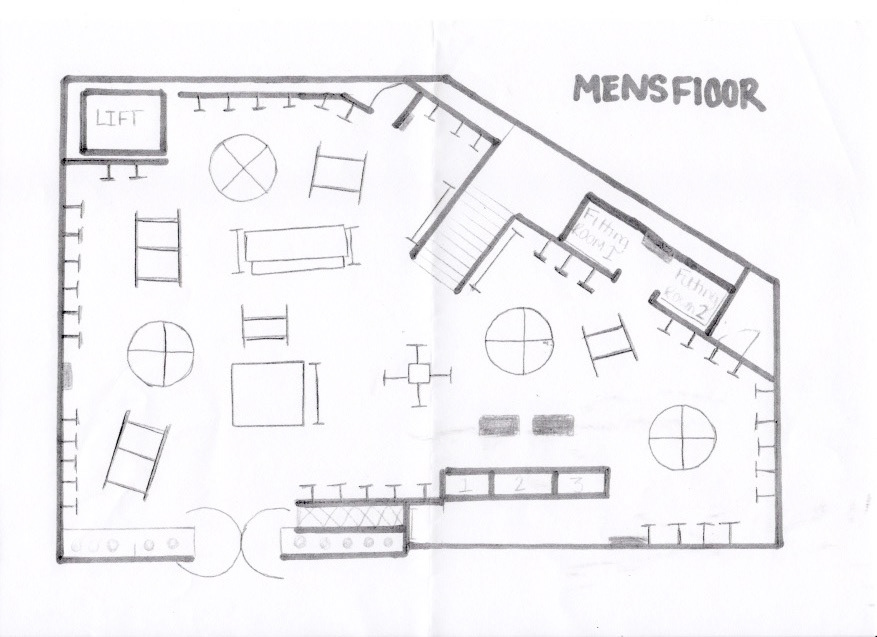
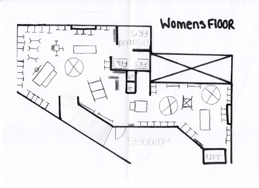
As part of Superdry's management team the stores visual merchandiser met with me to discuss creating clear visual floor plans to help with team management and product placements. I set aside some time and designed these floor plans to create clearer guidelines for the team and to assist in planning the ever changing layout of the store.
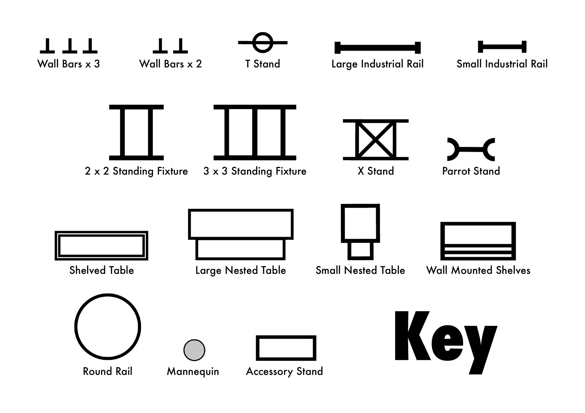
The stores original structural drawings were used as well as measurements taken in places where original data was lost or damaged. A lot of the fixture measurements had to be taken myself and applied to the correct scale in order to be accurate to the space; this was important to make sure fixtures were not moved in such a way that they would impede disabled access.
The first drafts of these plans were drawn out in pencil sketches before being scanned into Illustrator and developed into workable digital floor plans. These were later saved as a series of PNGs so that they could be edited in Powerpoint as the business had no direct access to Adobe programs.
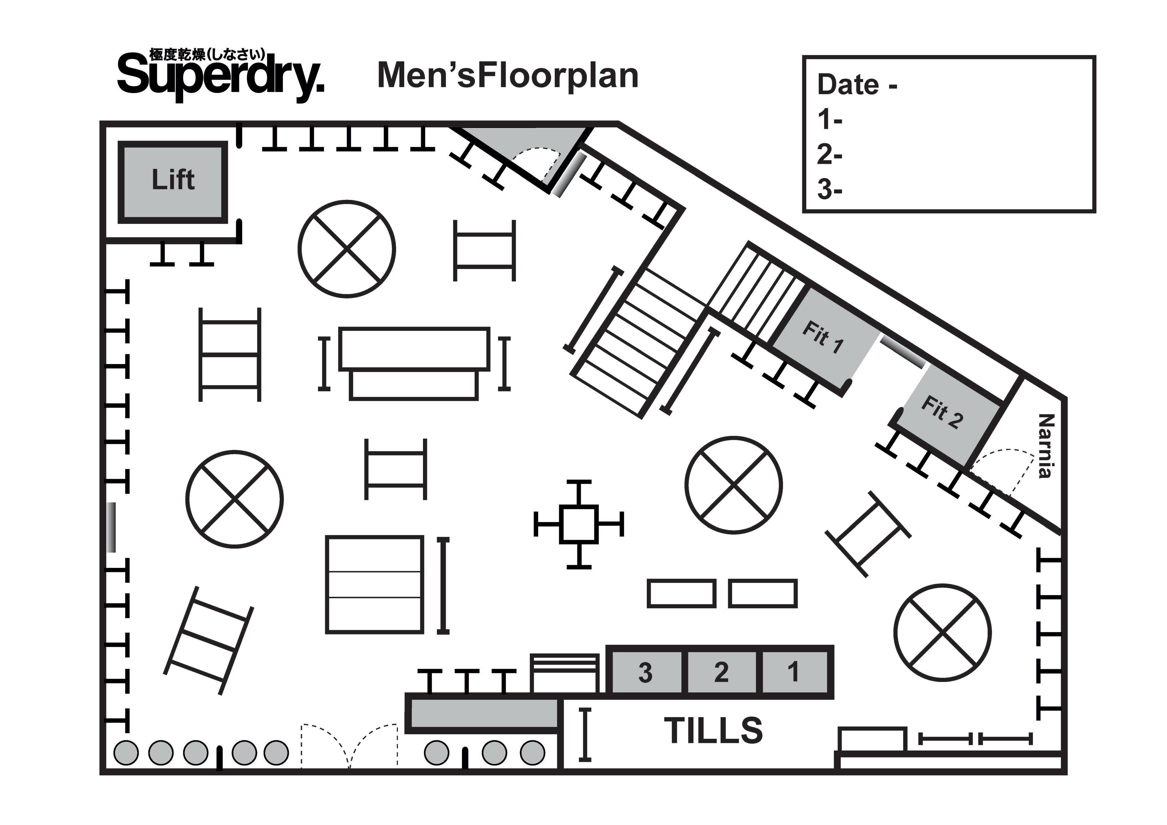
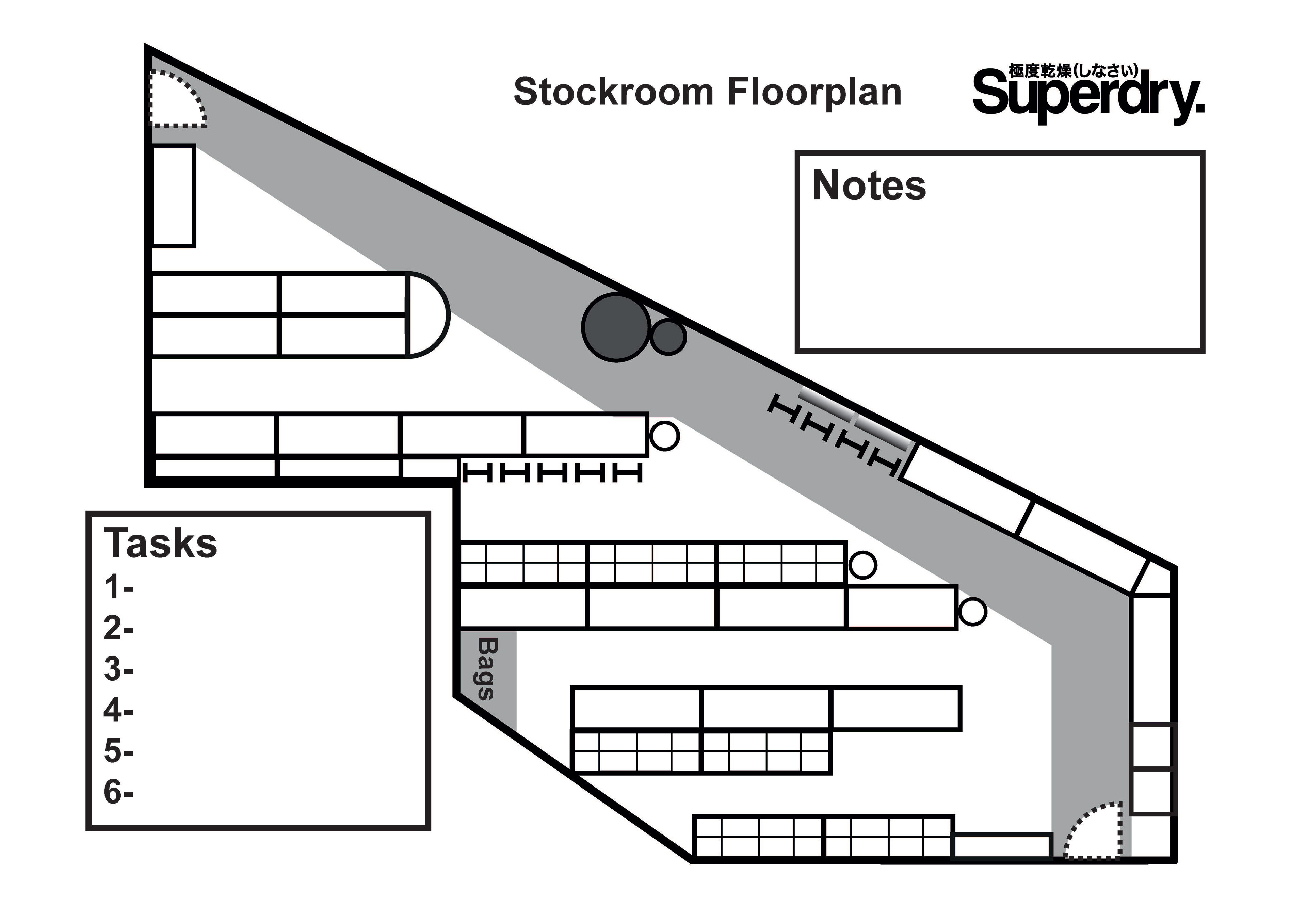
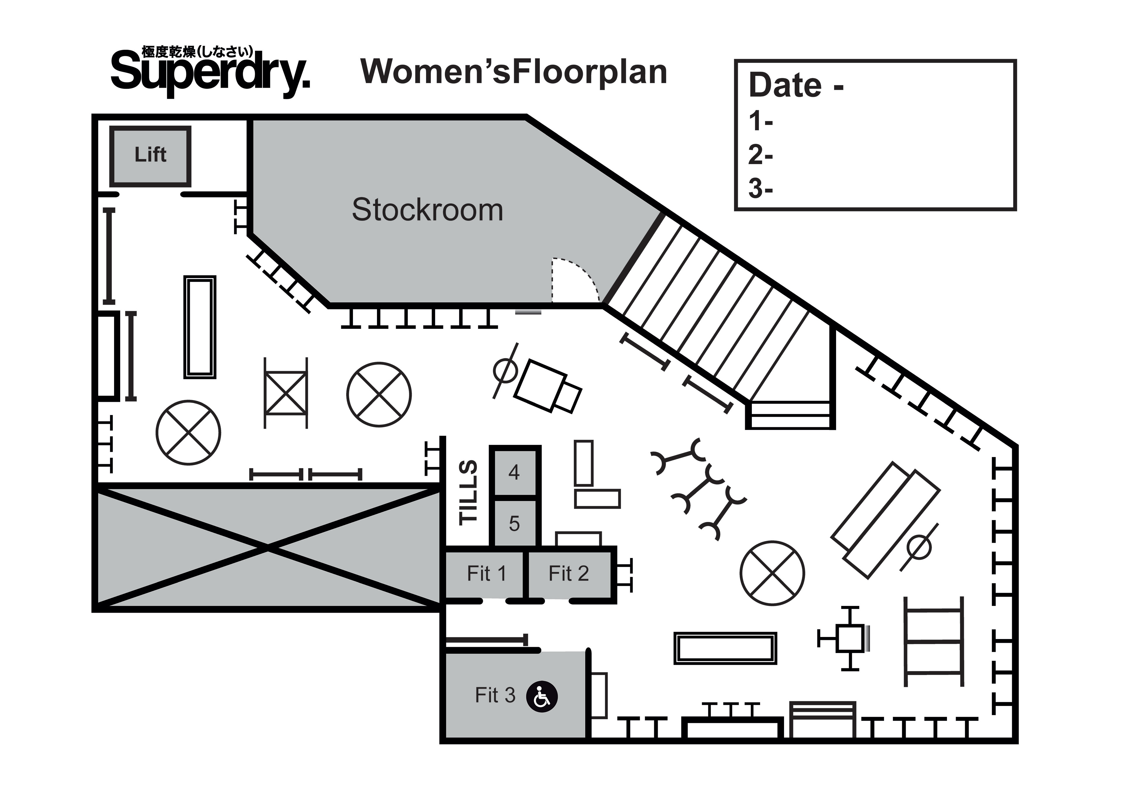
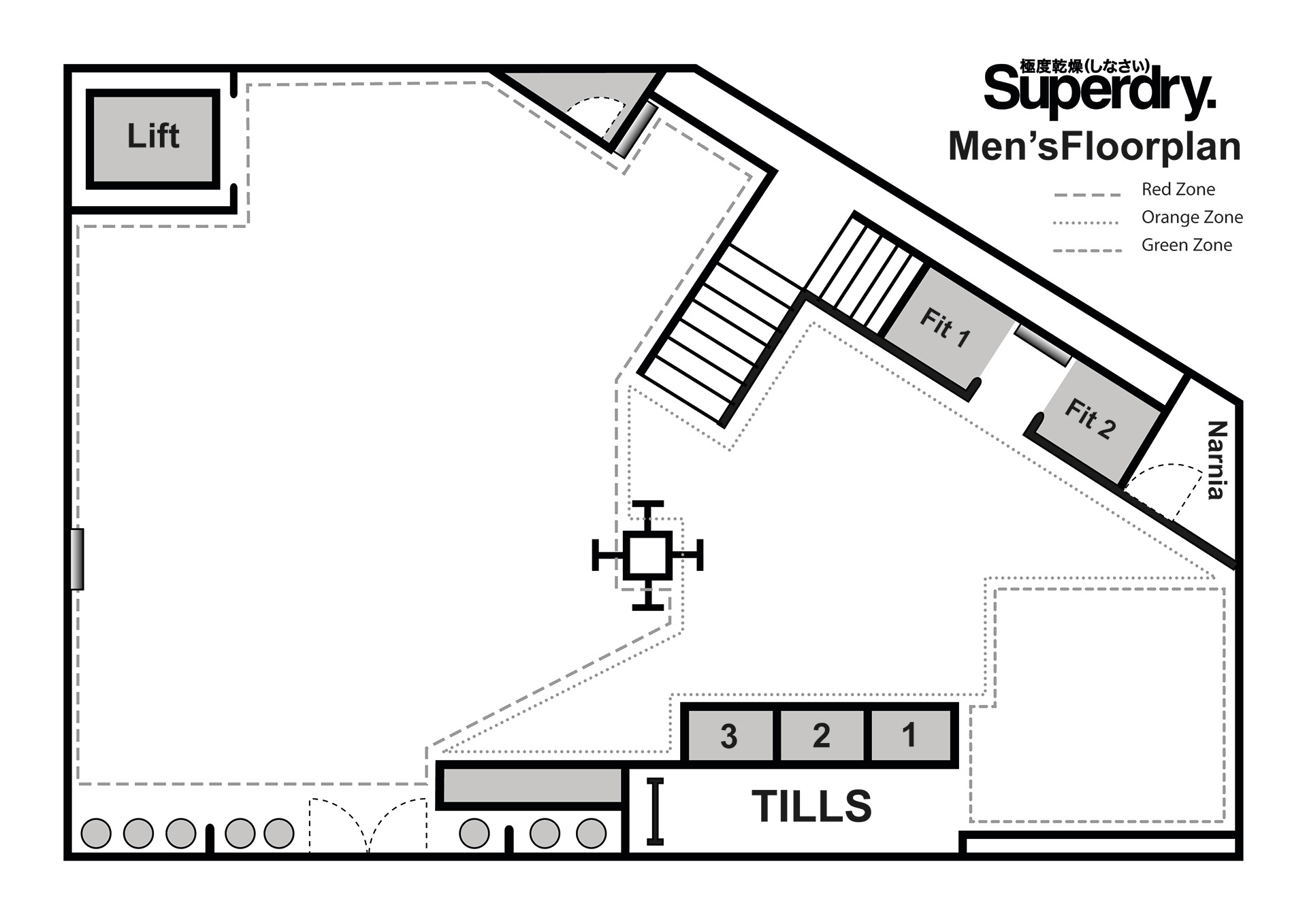
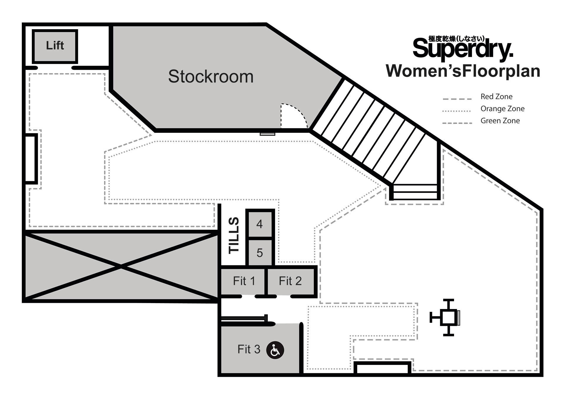
The below images are examples of the floor plans structure separated and saved as PNG files for use in Powerpoint. The base floor plans also had a series of dotted lines added to separate the floors into "coloured" zones to represent the hierarchy of the floor space based on a customers journey around the store. These zones are traditionally referred to by colour but the business only had access to B&W printers so the dots and dash lines were accepted with a key added.
Examples of the first sketches developed for the plans. These were some of the clearer examples as others were strewn with notes and measures to aid in later development. The Women's floor plan was also rotated 180 degrees so both plans line up more clearly.
